Four Grid / Flex Properties
CSS Grid and Flexbox are very helpful tools that I employ often when making web applications. There are four properties that overlap in both Grid and Flexbox that I use often, but I usually have to look up what they do to find the exact properties and values I want to use. These four are:
justify itemsalign itemsjustify contentalign content
My intention here is that I (and hopefully others) can look at this page to quickly find the right property and values to get the intended layout. Hopefully it doesn't end up being as long as the aforementioned long pages.
Also, a caveat: justify-items doesn't exist in Flexbox. Nonetheless, I'll discuss it here.
These properties define where items within the grid / box sit in their container. justify-items situates things on the main axis, whereas align-items is on the cross axis. This means that by default, align = vertical, justify = horizontal.
Examples
Let's start with a simple grid layout and do some experimentation. This CSS::
.grid {
  display: grid;
  background: red;
  padding: 10px;
  gap: 10px;
}

.grid-item {
  background: white;
}
with this HTML:
<div class="grid">
  <div class="grid-item">item</div>
  <div class="grid-item">item</div>
</div>
gives us:
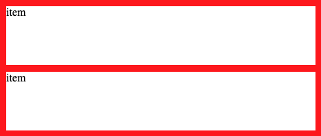
Here's our starting point. We have an explicit grid with two items, which seem to stretch to fill their available space. Also, the text is in the top left corner of each item. If we add the line:
justify-items: center;then the div's in our grid are horizontally centered, but vertically unaffected.

Or if we wanted to vertically align our items toward the end of their containers:
align-items: end;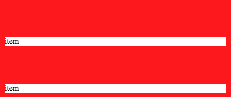
Both of our items are vertically aligned toward the end of their grid space. As you might assume, both properties have the value stretch by default. You can see this at work in the last two pictures. When one axis is aligned, the other axis still stretches to fill the remaining.
Also, you can set both values in one line by using the place-items property and separating the values with a slash (e.g. center / center).
The last two properties change where items sit within the grid space allocated for them, but do not change the location of the grid space. If our content is smaller than our grid container, it would be nice to specify where the allocated space goes, not just the items within the space. Luckily, that's exactly what these next two properties do.
Examples
Let's say we want to stack our items on the bottom of the grid. Well, we just tried using the align-items property, which affects the vertical axis, but we didn't get exactly what we're looking for. Let's try align-content.
align-content: end;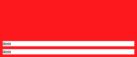
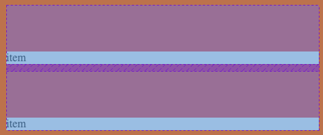
Instead of the content being being centered within their allocated grid space, that grid space itself has moved. That's a little confusing, so let's use Chrome dev tools to see this more clearly. Here's the grid with align-items: end;
And with align-content: end;
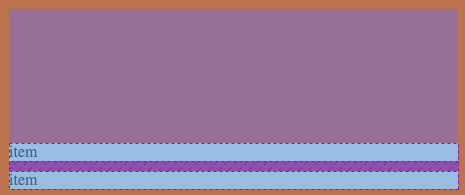
This clears up exactly what's going on. align-items changes where the items are within their allocated space (dotted lined boxes), but keeps this space stretched. align-content, on the other hand, changes where the space itself is.
The justify/align content properties also have the values space-evenly or space-between. These space items evenly within a grid, either counting the walls as other items or pushing items against the container.
To space evenly with the walls:
align-content: space-evenly;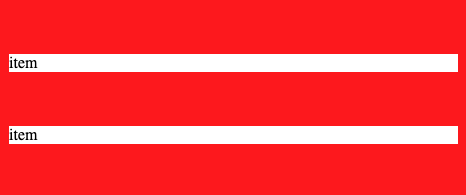
Or, to have items press up against the container:
align-content: space-between;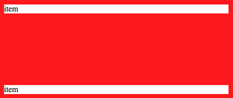
As with the first two properties, you can set values for these last two in one line by using the place-content property.
All of these properties can get a little bit confusing. For example, writing
align-content: stretch;will do exactly the same thing as
align-items: stretch;a lot of the time. If you want to align things in the start/center/end, It's probably a reasonable strategy to start with the items-based properties, and then try content if that doesn't seem to work. But for spacing things evenly, the content would be a good place to start.
I think that's pretty much it! Hopefully this clears up these four CSS properties.